March 2023
View our original newsletter here: Slide Decks
Guidelines for Great Slide Decks
The communication you do for work changes depending on the purpose and audience. And these factors--purpose and audience--can also affect our choice of medium: *how* we communicate. Sometimes, you'll need to present content to an audience using a tool like a slide deck, which allows us to combine images with text.
You might use a slide deck to capture the main concepts and key take-aways from a written report. In some cases, you might use them instead of a lengthy, written report. Because we imagine that the slide deck stands in for the report, we sometimes put too much text on our slides.
However, successful slide decks consider how an audience takes in information. Humans can only do one thing at a time: read or listen.
We like to think that we can do both at the same time, but we can't. Neuroscience shows that we are reading or listening, and switching back and forth between the two tasks. This means that when we are reading, we can't be listening. So we miss what the presenter is saying.
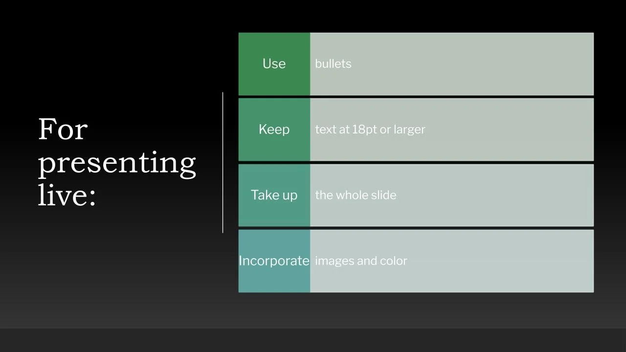
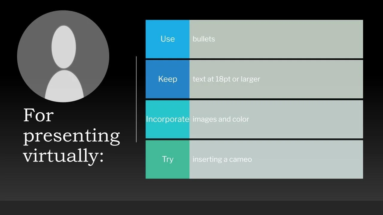
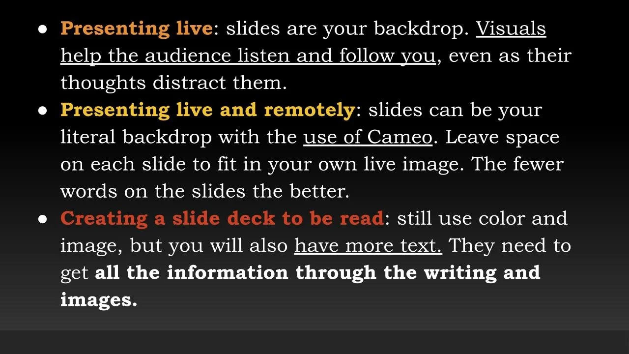
Since that's the case, slide decks that accompany a presentation should include very little writing on the slides themselves. These slides should include the keywords and concepts in 10 words or less and translate the rest into visual representations.
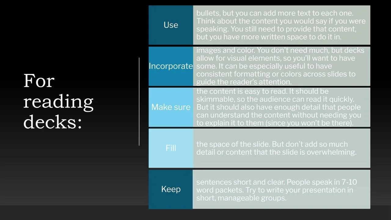
Alternatively, if the deck is being sent for someone to read--not to accompany a presentation--then more words can appear on the slides. Some of these reading decks can be content-dense, but they still have images and color mixed in to help the reader navigate through the concepts.
Slide decks for presentations: few words so the audience can follow along while listening to you.
Slide decks for reading: more words with concepts supported by image and color to help the reader keep reading.
Check out our recap of March to learn about creating effective Slide Decks and how to best reach your audience.
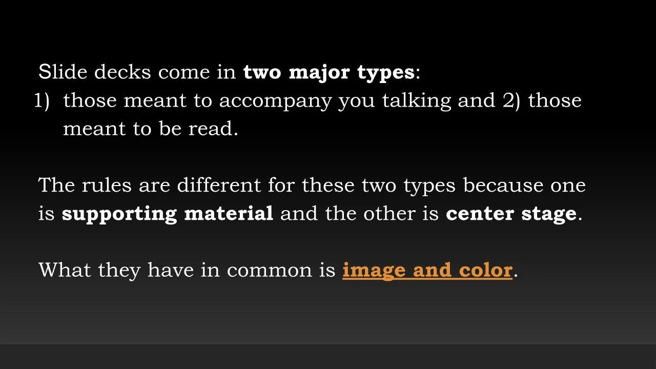
"Slide decks come in two major types: those meant to accompany you talking and those meant to be read. The rules are different for these two types because one is supporting material and the other is center stage.
What they have in common is image and color. Slide decks allow for visuals in a way that reports, memos, letters, and emails don’t. The slide is meant to be seen rather than read. We expect a slide to have more color than black and white. We expect the text to be accompanied by images. We appreciate colorful headings, highlighted words, background colors, and other design elements that are typically not part of other written formats..."
Tip: Good slide decks consider audience, purpose, and medium to determine the best way to deliver the content. And for almost *all* presentations, slide decks should include a few words (10 words per slide) and more images because our audience can't read and listen at the same time (As much as we claim we can...we can't. It's science.)
Jenny explains HOW and WHY you can create effective slides for your presentations!
What are the different moves for virtual, live, and reading decks? How can you translate your thoughts and writing into 10 or fewer keywords to create effective slides?
Don't Just Take Our Word For It
See what other industry experts are saying about successful slides...
How to reduce text on your presentation slides
"One major reason your audience is suffering from ‘death by PowerPoint’ is that you’re using slides that simply spell out what you’re trying to say. The problem is that words you see and words you hear are processed in one part of the brain, meaning it’s impossible to read and listen at the same time..."
Here's a great quick, visual guide about creating effective slides!
Go Further
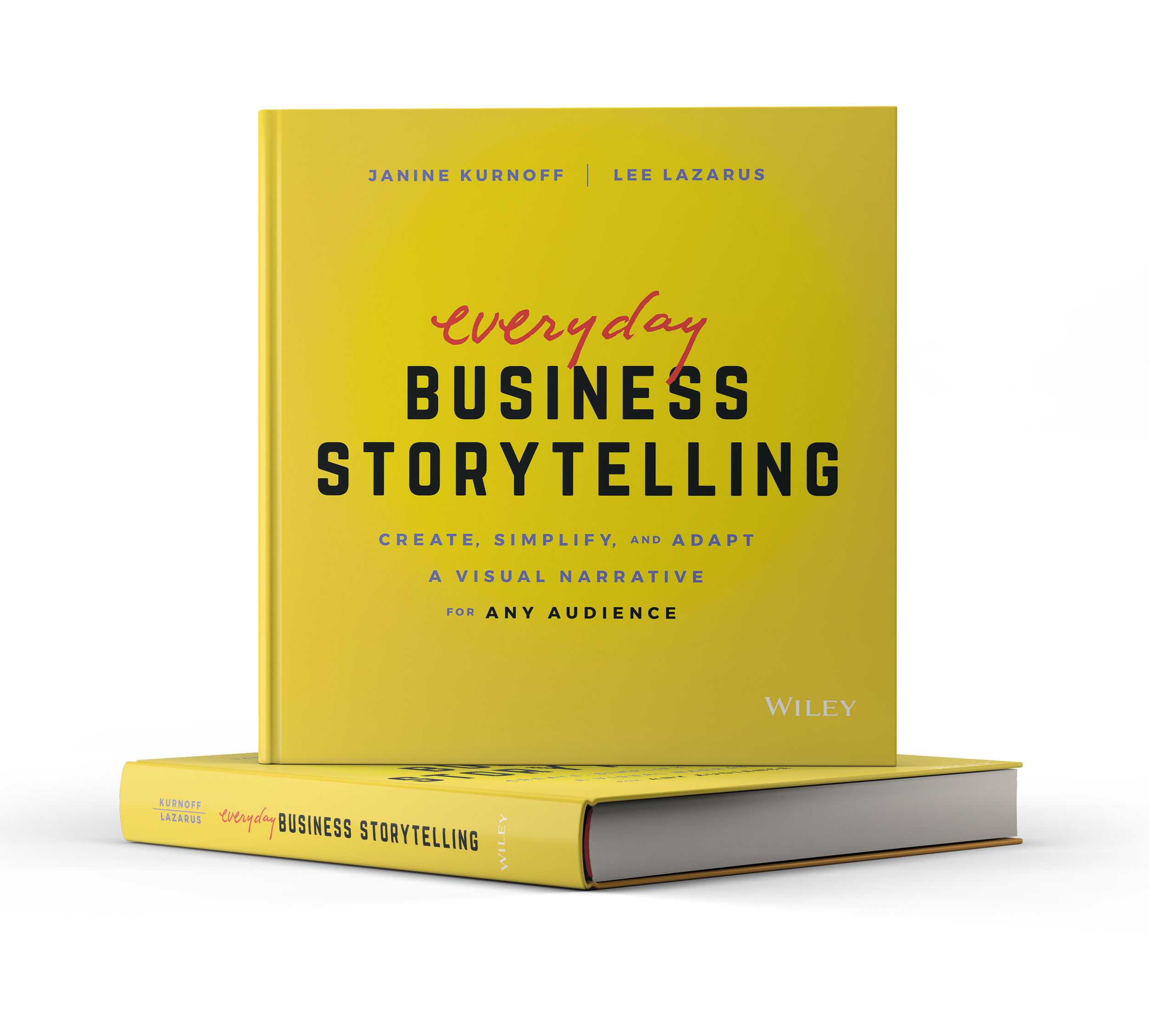
Want to know where we got this tip? A variety of resources. But the book Everyday Business Storytelling: Create, Simplify, and Adapt A Visual Narrative for Any Audience by Janine Kurnoff and Lee Lazarus gives some great information about transform business communications into memorable narratives that drive conversations.
"...Whether you're building a presentation, crafting a high-stakes email, or need to influence decisions in your next meeting with an executive, Everyday Business Storytelling offers an insightful exploration of how to develop compelling business narratives.
You'll discover how to use a simple, repeatable framework to choreograph your ideas, data, and insights into an authentic, persuasive story. Within this business book, you'll also find clever data visualization and visual display techniques to help humanize your stories and build an emotional connection with your audience, leading to improved presentation skills and effective data storytelling..."
Quote of the Month
"The success of your presentation will be judged not by the knowledge you send but by what the listener receives."
- Lilly Walters
