Helping Your Reader Read: 3 Ways To Make Your Writing Easier To Read

Jenny Morse, PhD
Author and CEO
Research shows that people are more likely to read things that are written in easy or familiar fonts. And, people are more likely to think that things written in unusual or “fun” fonts are difficult, challenging, and not worth reading.
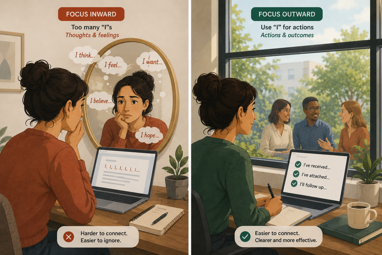
As professionals who write, we are most concerned with efficiently communicating information in order to generate new business, maintain business relationships, or just get work done. Most of us focus on what we need to say in order to accomplish those goals. But communication is a process that requires a message to be created and received. When we focus on creating the message, sometimes we forget to consider how that same message will be read by the person on the other end.

Want a more in-depth refresher on professional writing?
Try our Better Business Writing: On Demand course. This self-paced, virtual course will teach you strategies to become a more efficient and effective writer, and provide you with expert feedback.
When we receive messages, we may groan if we see one long paragraph without any breaks, or we may squint if the person uses a strange font or too much color. As readers, we notice when messages haven’t been written for us to read.
And so, we need to write messages that we would want to read and that the people on the other end will be willing to look at.
The keys for making your messages readable are pretty simple:
Use short paragraphs. People need to be able to see where the different ideas are. Paragraphs mark changes among ideas and give your reader cues about where to look. The shorter those paragraphs are, the more rest breaks you are building in for the reader. And as readers, we appreciate those rests!
Use bullet points. Most professionals are skimming messages, not reading every single word. Bullet points are another visual marker of where groups of important ideas can be found. Some of you reading this blog post will have glanced at the first few paragraphs and then gone right to these bullet points. Bullets make people look! Use them!
Use easy-to-read fonts. Sometimes, we want our day-to-day writing to look a little more special. We might dress it up by changing the color of the background, or the font color, or choosing one of the many supercool fonts available to us. While fonts can be fun, and may be useful for headings in marketing materials, if you are writing complete sentences and paragraphs, you need to make sure the reader can see the words easily or the reader won’t read them. The default fonts on most of our programs are considered legible. Helvetica is a favorite. Times New Roman, yes. Arial, sure. These fonts have long histories of being read, a lot, by people who care about words. Use them.
Most importantly, make sure that your text has visual markers that help guide the reader’s attention. If you are writing for yourself, you don’t need to worry about how the message is arranged because you are the only one who is going to see it. But, if you are writing for someone else, it’s not enough to get the ideas out of your head and onto the screen in front of you. You need to go a step further and actually craft those ideas so the person on the other end can find them easily, and read them.